KIDULTHOOD FILM TITLE ANALYSIS


00:00:01 - Hanway Films (Production Company)
00:00:10 - Stealth Films (Production Company)
The production company logos have been centred on a black screen to highlight the company names. The colours are also very simple which prevents distraction.

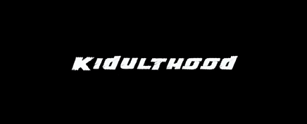
00:00:30 - Title: Kidulthood
The name of the film is the first title to appear on the screen to show that it is the most important title to show throughout the entirety of the film. The font is quite simple just has an artistic, graffiti style nature to it to emphasise that it is based on teenagers who may be involved in violence and vandalism. The non-diegetic sound of urban music is played in the background to also represent the type of people that will be portrayed in this film. The contrast between the bold, white font and plain, black background can draw the attention towards the film name.

00:00:38 - Main Characters
There is a wide, medium shot presenting the two girls in the centre. The non-diegetic sound of the music has become more intense which could cooperate with the high school setting to imply that school isn't a place for happiness and learning but more of an opportunity to see (or fuse arguments with) multiple people.

00:01:50 - A couple
This close up shot of the couple shows them being quite intimate and this could be considered quite an explicit scene. The rawness of this scene can be used as a wake up call for the audience to realise the reality of teenagers' lifestyles and relationships. The director has chosen to include shots like this for the sole purpose of presenting a typical situation for some teenagers rather than hiding the truth.


